A dashboard showing 47 open projects does not tell a delivery manager which project needs help this afternoon. The count may be accurate and still leave the manager opening the same five spreadsheets.
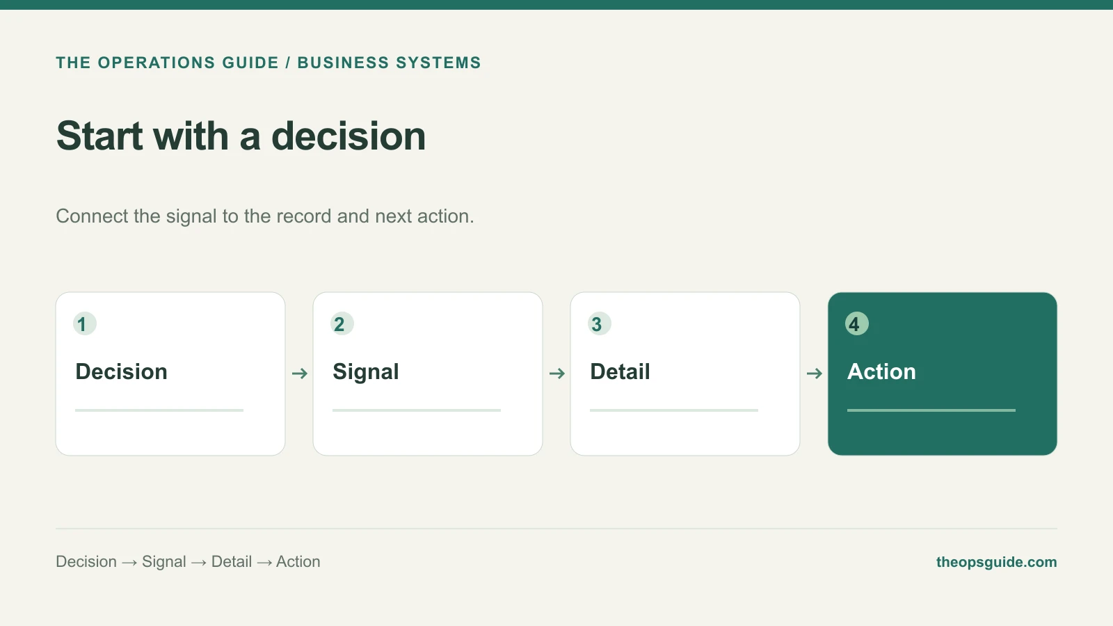
Before specifying charts, write down the decision the dashboard should make easier. Then work backward to the information and actions that decision requires.
Give one decision a complete card
Here is an illustrative requirement for a delivery team:
| Requirement | Example |
|---|---|
| Decision | Move a person to a project at risk this week |
| Signal | A milestone due this week has unresolved blocking work |
| Detail | Project, promised date, blocker, owner, remaining work, latest update |
| Action | Assign help, remove the blocker, or revise the promised date |
| Decision owner | Delivery manager |
| Freshness | Show the last successful source update and whether it is overdue |
This card suggests a focused list of at-risk milestones with links to the underlying work. It does not automatically call for a wall of gauges.
Make the summary lead somewhere useful
Aggregates are useful for spotting a pattern. The person acting on that pattern usually needs the individual records behind it.
If “overdue projects” is clickable, the resulting list should use the same definition as the count. Show the responsible person and the next unresolved action. Link to the place where the work can actually be updated, or provide that action directly if the system is designed to support it.
A reader should not have to reconstruct the calculation in another tool before deciding whether the warning matters.
Agree on the meaning before the layout
Ask what qualifies a project as overdue. Is it a missed client commitment, an internal task date, or either? Can a paused project count? Which date wins when systems disagree?
Write the definition beside the requirement and try it against a few real records. Disagreements at this stage are useful: they reveal decisions a polished chart would otherwise hide.
Microsoft's dashboard design guidance likewise starts with the audience and the decisions they need to make. The decision card above is one practical way to turn that principle into build requirements.
Match freshness to the decision
A weekly staffing review may work well with a reconciled morning snapshot. Dispatching work throughout the day may require much fresher information. “Real time” adds little value if nobody acts on the change until Friday.
Display the last successful source update, not merely the time the dashboard page opened. When the data is stale, make that visible so an old number does not look current.
Test it with a decision, not a compliment
Give the intended user a realistic situation and ask what they would do next. Watch whether they can identify the affected record, understand the signal, and reach the action without outside explanation.
If they admire the dashboard but still need a separate spreadsheet to make the decision, the requirements are unfinished.
The Ops Guide builds internal tools and dashboards around the decisions and handoffs they need to support.